弹性布局
大约 10 分钟
弹性布局
1、概述
随着技术的发展,当前的市场上,安装浏览器的客户端越来越多,设备也越来越多,所以CSS提供的布局,不仅应用于PC端,还可以应用于移动设备
弹性布局,也称之为Flex布局(Flexible Box)
这种布局方式是把 HTML 网页中每一个元素都看成1个能够进行自由伸缩的盒模型(Flex盒模型,弹性盒模型)
任何一个 HTML 元素都可以指定为 Flex 盒模型
.box{
 /* flex盒模型有2种,块级元素可以设置为flex盒模型,行内元素也可以通过 display: inline-flex; 设置为行级flex盒模型 */
   display: flex;
}
注意:当元素设为 Flex 布局元素以后,当前 Flex 盒模型元素的 float、clear 和 vertical-align 属性将失效,因为 flex 布局本身也提供了替代的属性
2、容器概念
- 采用 Flex 布局的元素,称为 Flex 容器(flex container),简称"容器"。
- 它的所有子元素自动成为容器成员,称为 Flex 项目(flex item),简称"项目"。
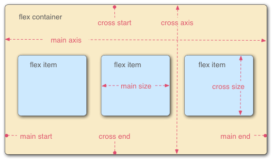
- 容器默认存在两根轴
- 水平的主轴(main axis,也叫横轴或 X 轴) 和垂直的交叉轴(cross axis,也叫纵轴或 Y 轴)。
- 主轴的开始位置(与边框的交叉点)叫做 main start,结束位置叫做 main end;交叉轴的开始位置叫做 cross start ,结束位置叫 cross axis 。
- 项目默认沿主轴排列
- 单个项目占据的主轴空间叫做 main size,占据的交叉轴空间叫做 cross size。
3、Flex容器的属性
- 提供了6个属性可以设置在flex容器上。
| 属性 | 描述 |
|---|---|
| flex-direction | 决定主轴的方向(即项目的排列方向) |
| flex-wrap | 默认情况下,项目都排在一条线(又称"轴线")上。flex-wrap属性定义,如果一条轴线排不下,如何换行。 |
| flex-flow | flex-flow属性是flex-direction属性和flex-wrap属性的简写形式,默认值为row nowrap。 |
| justify-content | 定义flex项目在主轴(x轴)上的对齐方式。 |
| align-items | 定义flex项目在交叉轴(y轴)上如何对齐。 |
| align-content | 定义多根轴线的对齐方式。如果项目只有一根轴线,该属性不起作用。 |
3.1、flex-direction
flex-direction属性决定主轴的方向 (即项目的排列方向)。
| 属性值 | 描述 |
|---|---|
| row | 按行正向排列 |
| row-reverse | 按行翻转排列 |
| column | 按列正向排列 |
| column-reverse | 按列翻转排列 |
效果图如下:
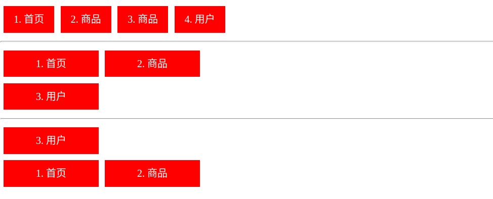
3.2、flex-wrap 属性
- 默认情况下,项目都排在一条线(又称"轴线")上。
flex-wrap属性定义,如果一条轴线排不下,如何换行。
| 属性值 | 描述 |
|---|---|
| nowrap | 默认值,不换行,压缩flex项目的宽度,让所有保持一行。 |
| wrap | 换行,不压缩flex项目的宽度,第一行在上方。 |
| wrap-reverse | 换行,不压缩flex项目的宽度,第一行在下方。 |
效果图如下:
3.3、flex-flow 属性
flex-flow属性是flex-direction属性和flex-wrap属性的简写形式,默认值为row nowrap。
.box {
    flex-flow: <flex-direction> || <flex-wrap>;
}
使用:
.box1{
	flex-flow: row nowrap;
}
.box2{
	flex-flow: row wrap;
}
.box3{
	flex-flow: row wrap-reverse;
}
3.4、justify-content 属性
justify-content属性定义了flex项目在主轴(x轴)上的对齐方式。
| 属性值 | 描述 |
|---|---|
flex-start | 在主轴(x轴)上以起点对齐(左对齐) |
flex-end | 在主轴(x轴)上以终点对齐(右对齐) |
center | 在主轴(x轴)上以中点对齐(居中对齐) |
space-between | 在主轴(x轴)上以两边对齐(两边对齐),平均分割元素之间的空隙,不保留最左与最右的空隙 |
| space-around | 在主轴(x轴)上以两边对齐(两边对齐),平均分割元素之间的空隙,保留最左与最右的空隙 |
3.5、align-items属性
align-items属性定义flex 项目在交叉轴( y 轴)上如何垂直对齐。
| 属性值 | 描述 |
|---|---|
| flex-start | 居上对齐 |
| flex-end | 居下对齐 |
| center | 垂直居中对齐 |
| baseline | 基于文本底线对齐 |
| stretch | 基于flex容器的上下边拉伸对齐 |
效果图如下:
3.6、align-content属性
align-content属性定义了多根轴线的对齐方式。- 如果项目只有一根轴线,该属性不起作用。
| 属性值 | 描述 |
|---|---|
| flex-start | 多行居上排列 |
| flex-end | 多行居下排列 |
| center | 多行居中排列 |
| space-between | 多行平均行间空隙排列,不保留首行上方与末行下方空隙 |
| space-around | 多行平均行间空隙排列,保留首行上方与末行下方空隙 |
| stretch |
4、Flex 项目的属性
- 以下6个属性设置在项目上。
| 属性 | 描述 |
|---|---|
order | 定义flex项目的排列顺序。数值越小,排列越靠前,默认为0。 |
| flex-grow | 定义flex项目的放大比例,默认为0,即如果存在剩余空间,也不放大。 |
| flex-shrink | 定义flex项目的缩小比例,默认为1,即如果空间不足,该项目将缩小。 |
| flex-basis | 定义在分配多余空间之前,flex项目占据的主轴空间(main size)。 浏览器根据这个属性,计算主轴是否有多余空间。它的默认值为auto,即flex项目的本来大小。 |
flex | flex属性是flex-grow, flex-shrink 和 flex-basis的简写,默认值为0 1 auto。后两个属性可选。 |
align-self | align-self属性允许单个flex项目有与其他flex项目不一样的对齐方式,可覆盖align-items属性。 默认值为auto,表示继承父元素的align-items属性,如果没有父元素,则等同于stretch。 |
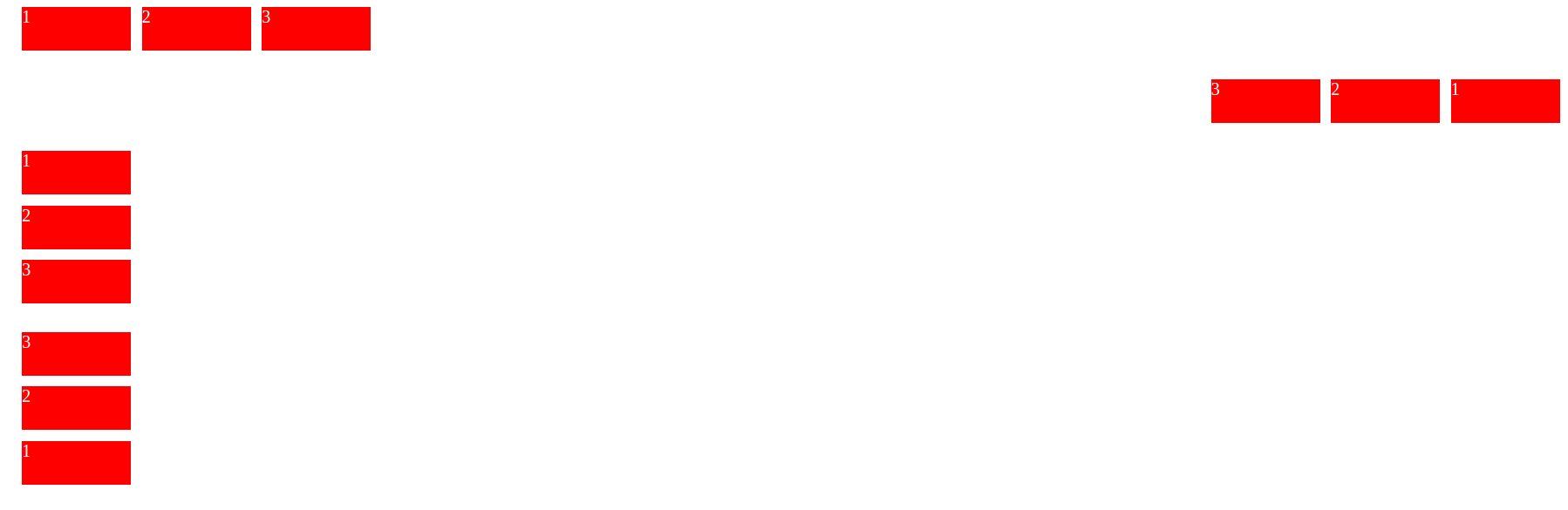
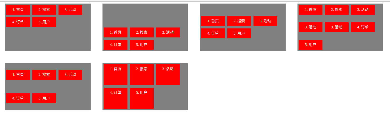
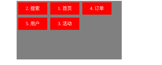
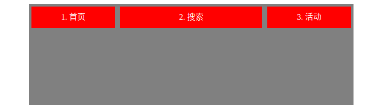
4.1、order属性
order属性定义项目的排列顺序。数值越小,排列越靠前,默认为0。
<!DOCTYPE html>
<html lang="en">
<head>
    <meta charset="UTF-8">
    <title>Title</title>
    <style>
    ul{display: flex; float: left; flex-wrap: wrap; list-style: none;padding: 0; margin: 0; margin-left: 50px; margin-bottom: 50px; max-width: 360px; height: 200px; background: gray;}
    li{width: 100px; min-height: 42px; line-height: 42px; text-align: center; margin: 5px; background: red; color: white;}
    .box1{align-content: flex-start;}
    .box1 li:nth-child(1){order: 2;}
    .box1 li:nth-child(2){order: 1;}
    .box1 li:nth-child(3){order: 5;}
    .box1 li:nth-child(4){order: 3;}
    .box1 li:nth-child(5){order: 4;}
    </style>
</head>
<body>
    <ul class="box1">
        <li>1. 首页</li>
        <li>2. 搜索</li>
        <li>3. 活动</li>
        <li>4. 订单</li>
        <li>5. 用户</li>
    </ul>
</body>
</html>
4.2、flex-grow属性
flex-grow属性定义项目的放大比例,默认为0,即如果存在剩余空间,也不放大。- 如果所有项目的
flex-grow属性都为1,则它们将等分剩余空间(如果有的话)。 - 如果一个项目的
flex-grow属性为2,其他项目都为1,则前者占据的剩余空间将比其他项多一倍。
<!DOCTYPE html>
<html lang="en">
<head>
    <meta charset="UTF-8">
    <title>Title</title>
    <style>
    ul{display: flex; float: left; flex-wrap: wrap; list-style: none;padding: 0; margin: 0; margin-left: 50px; margin-bottom: 50px; width: 640px; height: 200px; background: gray;}
    li{width: 50px; min-height: 42px; line-height: 42px; text-align: center; margin: 5px; background: red; color: white;}
    .box1{align-content: flex-start;}
    .box1 li:nth-child(1){flex-grow: 1;}
    .box1 li:nth-child(2){flex-grow: 2;}
    .box1 li:nth-child(3){flex-grow: 1;}
    </style>
</head>
<body>
    <ul class="box1">
        <li>1. 首页</li>
        <li>2. 搜索</li>
        <li>3. 活动</li>
    </ul>
</body>
</html>
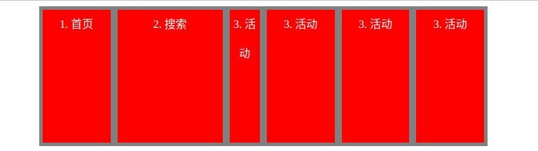
4.3、flex-shrink属性
flex-shrink 属性定义了项目的缩小比例,默认为1,即如果空间不足,该项目将缩小。
- 负值对该属性无效。
如果所有项目的 flex-shrink 属性都为1,当空间不足时,都将等比例缩小。
如果一个项目的 flex-shrink 属性为0,其他项目都为1,则空间不足时,前者不缩小。
<!DOCTYPE html>
<html lang="en">
<head>
    <meta charset="UTF-8">
    <title>Title</title>
    <style>
    ul{display: flex; float: left; list-style: none; padding: 0; margin: 0; margin-left: 50px; margin-bottom: 50px; width: 640px; height: 200px; background: gray;}
    li{width: 150px; min-height: 42px; line-height: 42px; text-align: center; margin: 5px; background: red; color: white;}
    .box1{align-content: flex-start;}
    .box1 li:nth-child(1){flex-shrink: 1;}
    .box1 li:nth-child(2){flex-shrink: 0;}
    .box1 li:nth-child(3){flex-shrink: 2;}
    </style>
</head>
<body>
    <ul class="box1">
        <li>1. 首页</li>
        <li>2. 搜索</li>
        <li>3. 活动</li>
        <li>3. 活动</li>
        <li>3. 活动</li>
        <li>3. 活动</li>
    </ul>
</body>
</html>
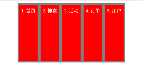
4.4、flex-basis属性
- flex-basis 属性定义了在分配多余空间之前,项目占据的主轴空间(main size)。
- 浏览器根据这个属性,计算主轴是否有多余空间。它的默认值为
auto,即项目的本来大小。
- 浏览器根据这个属性,计算主轴是否有多余空间。它的默认值为
- 它可以设为跟
width或height属性一样的值(比如 350px ),则项目将占据固定空间。
<!DOCTYPE html>
<html lang="en">
<head>
    <meta charset="UTF-8">
    <title>Title</title>
    <style>
    ul{display: flex; float: left; list-style: none; padding: 0; margin: 0; margin-left: 50px; margin-bottom: 50px; width: 360px; height: 200px; background: gray;}
    li{width: 150px; min-height: 42px; line-height: 42px; text-align: center; margin: 5px; background: red; color: white;}
    .box1{align-content: flex-start;}
    .box1 li:nth-child(1){flex-basis: 100px;}
    .box1 li:nth-child(2){flex-basis: 100px;}
    .box1 li:nth-child(3){flex-basis: 100px;}
    .box1 li:nth-child(4){flex-basis: 100px;}
    .box1 li:nth-child(5){flex-basis: 100px;}
    </style>
</head>
<body>
    <ul class="box1">
        <li>1. 首页</li>
        <li>2. 搜索</li>
        <li>3. 活动</li>
        <li>4. 订单</li>
        <li>5. 用户</li>
    </ul>
</body>
</html>
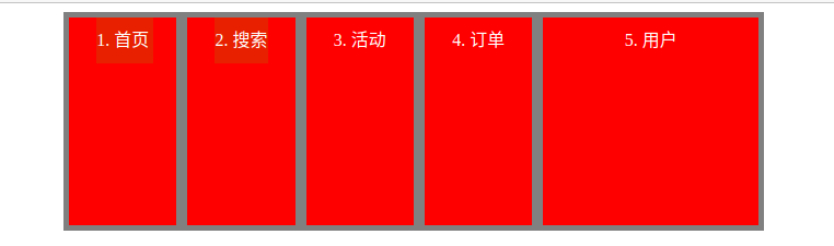
4.5、flex属性
flex属性是 flex-grow, flex-shrink 和 flex-basis的简写,默认值为0 1 auto。后两个属性可选。
该属性有两个快捷值:auto (1 1 auto) 和 none (0 0 auto)。
建议优先使用这个属性,而不是单独写三个分离的属性,因为浏览器会推算相关值。
<!DOCTYPE html>
<html lang="en">
<head>
    <meta charset="UTF-8">
    <title>Title</title>
    <style>
    ul{display: flex; float: left; list-style: none; padding: 0; margin: 0; margin-left: 50px; margin-bottom: 50px; width: 640px; height: 200px; background: gray;}
    li{width: 150px; min-height: 42px; line-height: 42px; text-align: center; margin: 5px; background: red; color: white;}
    .box1{align-content: flex-start;}
    .box1 li:nth-child(1){flex: 1;}
    .box1 li:nth-child(2){flex: 1;}
    .box1 li:nth-child(3){flex: 1;}
    .box1 li:nth-child(4){flex: 1;}
    .box1 li:nth-child(5){flex: 2;}
    </style>
</head>
<body>
    <ul class="box1">
        <li>1. 首页</li>
        <li>2. 搜索</li>
        <li>3. 活动</li>
        <li>4. 订单</li>
        <li>5. 用户</li>
    </ul>
</body>
</html>
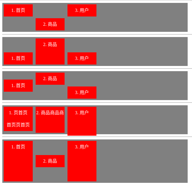
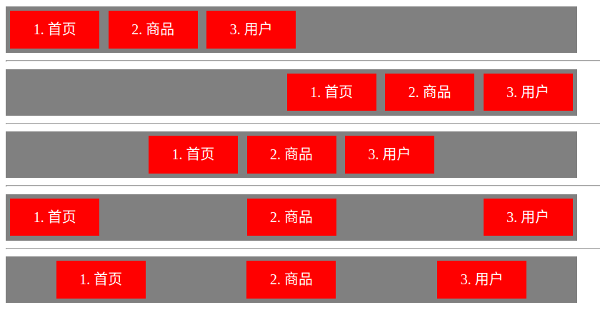
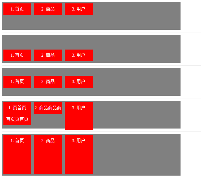
4.6、align-self属性
align-self属性允许单个项目有与其他项目不一样的对齐方式,可覆盖align-items属性。
默认值为auto,表示继承父元素的align-items属性
- 如果没有父元素,则等同于stretch。
该属性可能取6个值,除了auto,其他都与align-items属性完全一致。
| 属性值 | 描述 |
|---|---|
| auto | 默认值,表示当前flex项目集成父元素flex容器中的align-items的属性值 |
| flex-start | 居上对齐 |
| flex-end | 居下对齐 |
| center | 垂直居中对齐 |
| baseline | 基于首行文本的底线对齐 |
| stretch | 垂直拉伸元素的高度与父元素flex容器一致。 |
<!DOCTYPE html>
<html lang="en">
<head>
    <meta charset="UTF-8">
    <title>Title</title>
    <style>
    ul{display: flex;list-style: none;padding: 0; margin: 0; max-width: 640px; height: 100px; background: gray;}
    li{width: 100px; min-height: 42px; line-height: 42px; text-align: center; margin: 5px; background: red; color: white;}
    .box1{align-items: flex-start;}
    .box2{align-items: flex-end;}
    .box3{align-items: center;}
    .box4{align-items: baseline}
    .box5{align-items: stretch}
    .box1 li:nth-child(2){align-self: flex-end;}
    .box2 li:nth-child(2){align-self: stretch;}
    .box3 li:nth-child(2){align-self: flex-start;}
    .box3 li:nth-child(3){align-self: flex-end;}
    .box4 li:nth-child(2){align-self: stretch;}
    .box5 li:nth-child(2){align-self: center;}
    </style>
</head>
<body>
    <ul class="box1"><li>1. 首页</li><li>2. 商品</li><li>3. 用户</li></ul>
    <hr>
    <ul class="box2"><li>1. 首页</li><li>2. 商品</li><li>3. 用户</li></ul>
    <hr>
    <ul class="box3"><li>1. 首页</li><li>2. 商品</li><li>3. 用户</li></ul>
    <hr>
    <ul class="box4">
        <li>1. 页首页<br>首页页首页</li>
        <li>2. 商品商品商</li>
        <li style="line-height: 42px;height: 100px;">3. 用户</li>
    </ul>
    <hr>
    <ul class="box5" style="height: 150px;"><li>1. 首页</li><li>2. 商品</li><li>3. 用户</li></ul>
</body>
</html>